Collapsing two grids of buttons into two dropdowns lifted profit per visitor 33%.
GROSS PROFIT PER VISITOR
CONVERSION RATE
ORDERS IN THE TEST
The quick version
A coffee brand replaced the grids of size and flavor buttons on its product pages with two compact dropdowns. Profit per visitor rose 33%, and conversion rose 28% across roughly 1,700 orders.
The setup
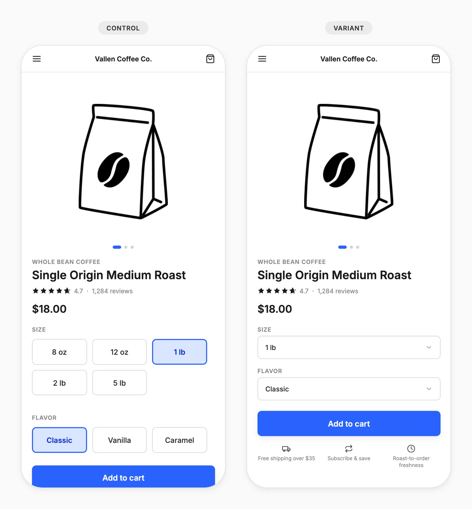
The brand's product pages asked for two decisions before Add to Cart: size and flavor. Both were laid out as grids of individual buttons, stacked one above the other, and together they took up a large block of the buy box.
The grids might have been working against them. Options laid out flat look like a decision to be researched, while the same options in a dropdown might look like a default to be accepted.
What they tested
Control: Size and flavor both shown as grids of individual buttons.
Variant: Both selectors collapsed into compact dropdowns.
The results
Every stage of the funnel moved in the same direction. More visitors added to cart, more began checkout, and more finished, with each step compounding the one before it.
Gross profit / visitor: +33%
Revenue / visitor: +37%
Conversion rate: +28%
Add to cart rate: +19%
Units / order: +21%
The takeaway
Showing fewer options at once sold more product, without removing a single option. Every option stayed one click away. A grid of buttons might read as an open question, while a dropdown reads as an already answered one.
Buttons of equal visual weight give the eye nowhere to settle, and two stacked grids of them push Add to Cart well down the page. Collapsing both into dropdowns pulled the button back up beside the price, also making it the most prominent element in the buy box.
Intelligems lets you A/B test selectors, layouts, and buy-box content on your Shopify store, with COGS built in so you see the profit impact, not just revenue, without any coding.