How a Sports Brand Turned a Product Benefits List Into a 17% Profit Lift
Swapping an emoji bullet list for an icon grid lifted profit per visitor 17% by winning more add-to-carts and fewer second thoughts after them.
GROSS PROFIT PER VISITOR
CONVERSION RATE
ORDERS IN THE TEST
The quick version
A sports brand listed five product benefits on its product page with an emoji at the start of each line. They replaced it with an icon-illustrated grid showing four benefits by default and an expand option for two more feature details. Profit per visitor rose 17%, and conversion rose 13% across more than 1,900 orders.
The setup
Both versions of the benefits section already existed in the theme, so the test was which one displayed. That kept the change to a single swap with nothing new to build.
The team expected a benefits section to work on the front half of the funnel. Better-presented benefits should persuade more browsers to add to cart. That is the job this kind of content is usually hired to do.
What they tested
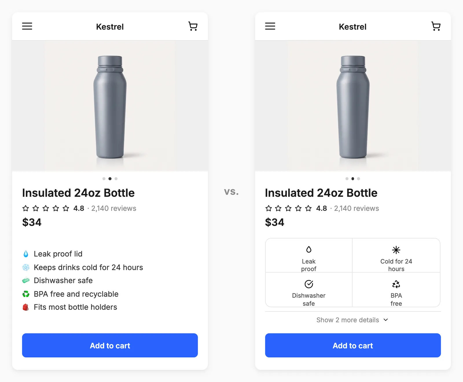
Control: Five benefits as a plain text list, one emoji per line.
Variant: Four benefits in an icon grid, with two further feature details behind an expand.
The results
Over about 36 days, roughly 55,000 visitors and 1,900 orders, split evenly between the two groups.
Gross profit / visitor: +17%
Revenue / visitor: +16%
Conversion rate: +13%
Checkout begin rate: +10%
Cart abandonment: -6%
Add to cart rate: +4%
Add to cart rose 4%, checkout begin rate rose 10%, conversion rose 13%, and cart abandonment fell 6%. Both halves of the funnel moved: more shoppers added to cart, and more of the ones who added went on to buy.
Average order value, units per order, and discount per order all held flat, so none of the lift came at the expense of margin.
The takeaway
The new format did two things. It encouraged more shoppers to add to cart, up 4%. It also reduced doubt for those who already had, with completion among them up about 8%.
Benefits sections are usually written to convince someone to add to cart, but a shopper who has already added the product knows they want it. What stops them now is doubt: will it fit, will it last, does it do what I need? The icon grid answered those questions better than five lines of text.
Why it worked
The words never changed, only the format. Both versions of the claims already existed in the theme, so presentation was the only variable. If your benefits are underperforming, test how you show them before you write new ones.
Four illustrated benefits beat five plain ones. The winner showed less by default and put two further details behind an expand.
The extra orders cost nothing. Order value, units per order, and discount per order all held flat, so the lift was pure conversion rather than bought volume. Check those three before shipping a conversion win, because a lift sitting next to a rising discount line is a different result.
Intelligems lets you A/B test benefits sections, product page content, and page layout on your Shopify store, with COGS built in so you see the profit impact, not just revenue, without any coding.