How an activewear brand grew profit per visitor 16% without touching price or product

They did the comparison shopping for the shopper.
GROSS PROFIT PER VISITOR
CONVERSION RATE
ORDERS IN THE TEST
The quick version
An activewear brand sells a technical product that photographed a lot like everyone else's. Their homepage said plenty about the brand and nothing about how it stacked up against the alternatives. Adding one comparison section, above the first product banner, grew profit per visitor by about 16%.
The setup
Their homepage ran the usual shape: hero, promo banner, a grid of feature icons, then straight into a product banner. Every element described the brand, and none of it compared it to anyone else.
That layout assumed the visitor had already chosen you and only needed help picking a product, which works for a returning customer but may not for someone still deciding. The page wasn’t making the case for why a shopper should choose this brand over another.
In a category where the products all photograph the same, that question became really important.
What they tested
One new section, inserted between the feature grid and the first product banner.
Control: The existing homepage.
Variant: The same page, plus a section headed with a "what makes us different" line, carrying a 5-star badge with 15,000+ reviews and a six-row comparison table putting the brand against "other brands" across fit, ease of use, all-day comfort, technical performance, domestic manufacturing, and durability. Green checks in their column, red X's in the other.
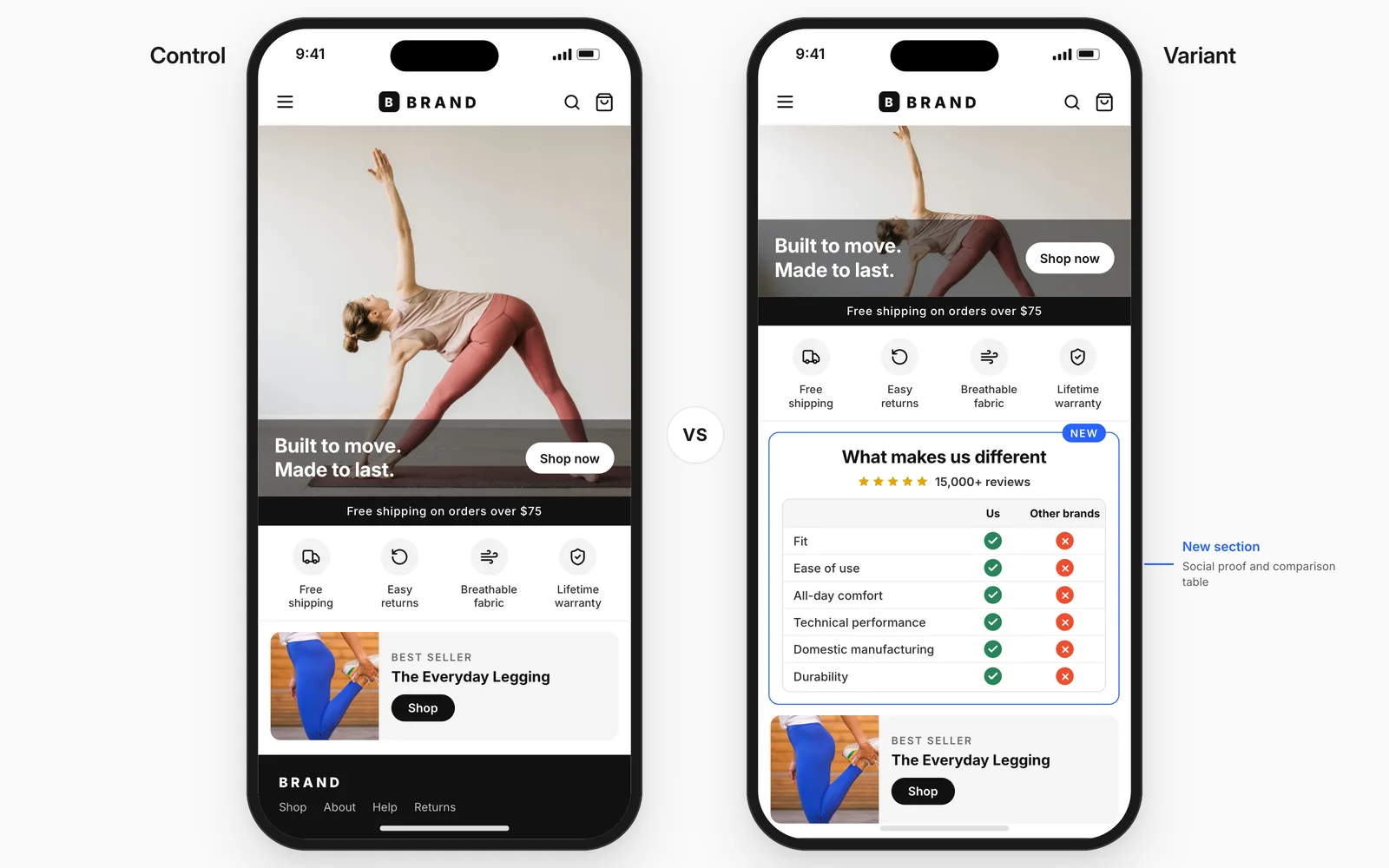
The team built and added the section with the Atlas Visual Builder, so it took no theme work and no developer time.
The results
Over 19 days, roughly 24,000 visitors and just over 1,200 orders, split evenly.
Gross profit / visitor: +16%
Revenue / visitor: +15%
Checkout begin rate: +10%
Conversion rate: +10%
Add to cart rate: +7%
Every stage of the funnel improved by a similar amount, and order size stayed flat throughout. More people bought, and the ones who did bought the same as before.
The takeaway
Their new homepage clearly outlined the comparison their shoppers were already making. Building one comparison section was worth about 16% in profit per visitor, with no change to price, product, or offer.
If your homepage only describes your own product, a shopper weighing you against two other brands is doing that research somewhere else.
Why it worked
It explicitly answered the question a visitor might subconsciously have. In a category where products photograph identically, "why you and not them" is the blocker, and the homepage wasn't addressing it.
Profit per visitor confirmed the conversion gain wasn't bought. Order value stayed flat and outside significance, so the extra conversions came without discounting margin away.
Intelligems lets you A/B test homepage sections, comparison content, and page layout on your Shopify store, with COGS built in so you see the profit impact, not just revenue, without any coding.