AB Testing
Mar 3, 2026
How can I improve my PDP design?
How to design the optimal PDP, built on best practices and results from thousands of customer tests.

Every section of your PDP should answer a question, remove a doubt, or push the visitor closer to clicking "Add to Cart.”
The best PDP isn't the prettiest. It's the one that makes buying feel obvious, safe, and easy.
Three questions your page must answer within 5 seconds of arrival:
What is it? (Clear product name + hero image)
Why should I want it? (Benefit-led copy + social proof)
Can I trust you? (Trust signals, reviews, guarantees)
Everything below serves one of these three jobs.
Section 1: Above the Fold — The Buy Box
This is the highest-leverage real estate on your store. A visitor who lands above the fold and immediately gets clarity on what the product is, why it's for them, and how to get it will convert at a significantly higher rate than one who has to hunt for that information. Nail this section before touching anything else.
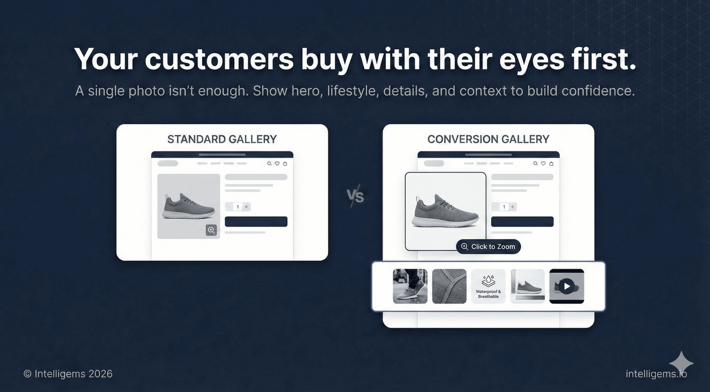
1.1 — Image Gallery
The product image is your first and most powerful conversion tool. Visitors make emotional purchase decisions visually before they read a word.
What to include:
Hero product shot — clean background, product centered, professional lighting
Lifestyle shots — product in use, in real environments, with aspirational but believable framing
Benefit/infographic slides — visual callouts that communicate key product advantages without requiring the shopper to read body copy
Detail shots — materials, texture, craftsmanship, finishing
Scale or context shot — helps customers understand size, fit, or proportion
Video — even a short loop increases time on page and purchase confidence
Best practices:
Use square (1:1) images for mobile consistency across Shopify themes
Minimum 2048 x 2048px resolution for zoom functionality
Cap the gallery at 6-8 images — beyond that, engagement drops
Your first image must also perform as a collection page thumbnail
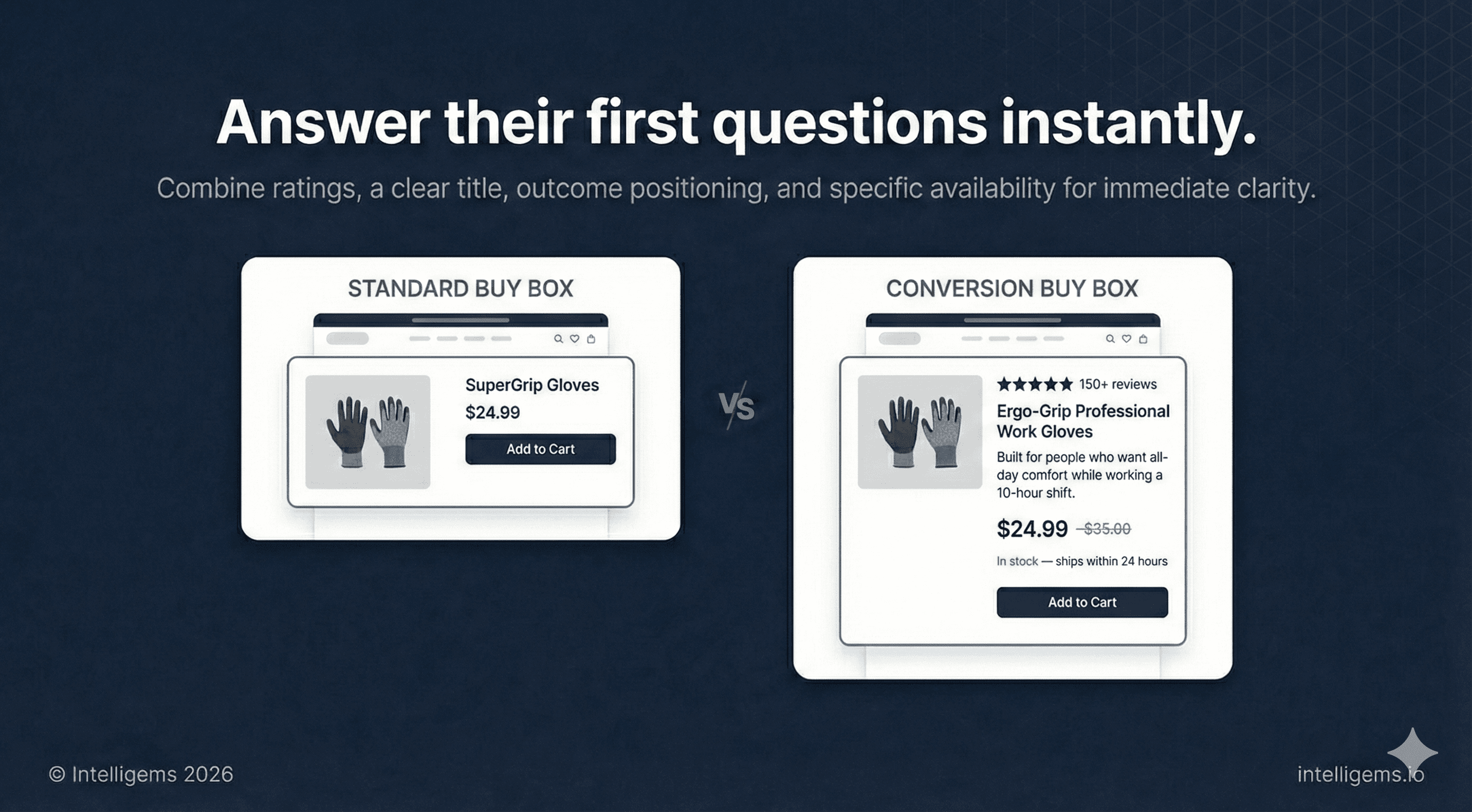
1.2 — Rating Summary
Place an aggregate star rating and review count near the top of the page, above or immediately below the product title. This should never be the first thing a customer has to scroll to find.
Example: "★★★★★ 150+ reviews"
Visible review counts near the top of the buy box reduce bounce rate and improve add-to-cart rate, especially for customers arriving from paid ads who have no prior brand awareness.
1.3 — Product Title and Positioning Line
Title: Descriptive and searchable. Prioritize clarity over cleverness.
Positioning line: A single sentence beneath the title that frames the product around an outcome, not a feature.
Example: "Built for people who want all-day comfort while working a 10-hour shift."
This line does fast work for shoppers who are deciding whether this product is relevant to them.
1.4 — Price, Availability, and Delivery
Show price prominently. If running a promotion, use price anchoring: display the original price struck through next to the sale price.
Availability and shipping copy:
"In stock — ships within 24 hours"
For limited inventory: "Only [X] left" — use this accurately
Specific estimated delivery ("Order today, arrives by [date]") converts better than vague ranges
“Free shipping on all orders”
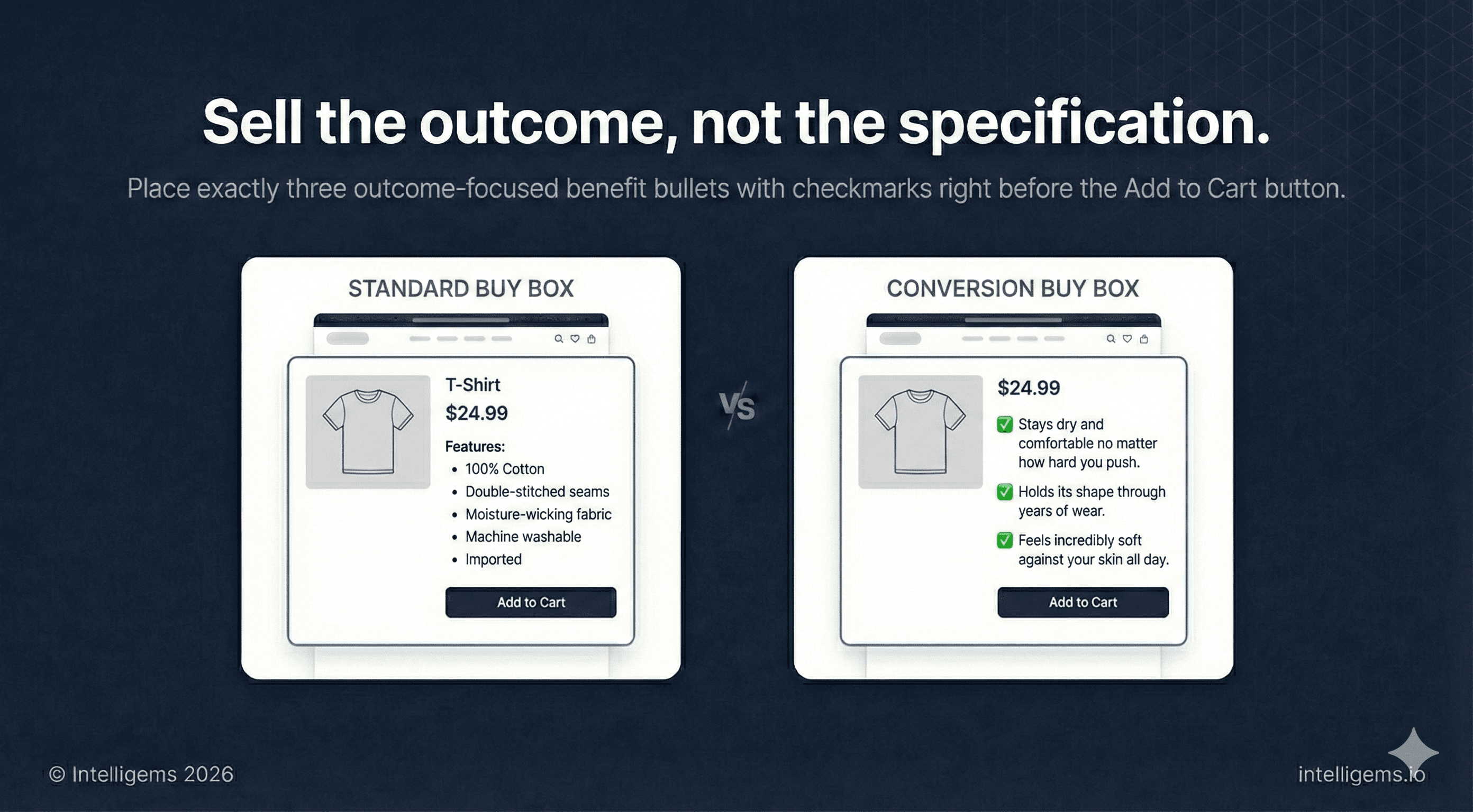
1.5 — Benefit Bullets
Three short benefit statements, formatted as a checklist, placed before the CTA. These are outcomes, not specs.
Write them as: ✓ [What the customer gains or avoids]
Not "Premium stitching" but "Holds its shape through years of wear." Not "Moisture-wicking fabric" but "Stays dry and comfortable no matter how hard you push."
Three is the right number. Fewer feels light; more creates scroll fatigue right before the CTA.
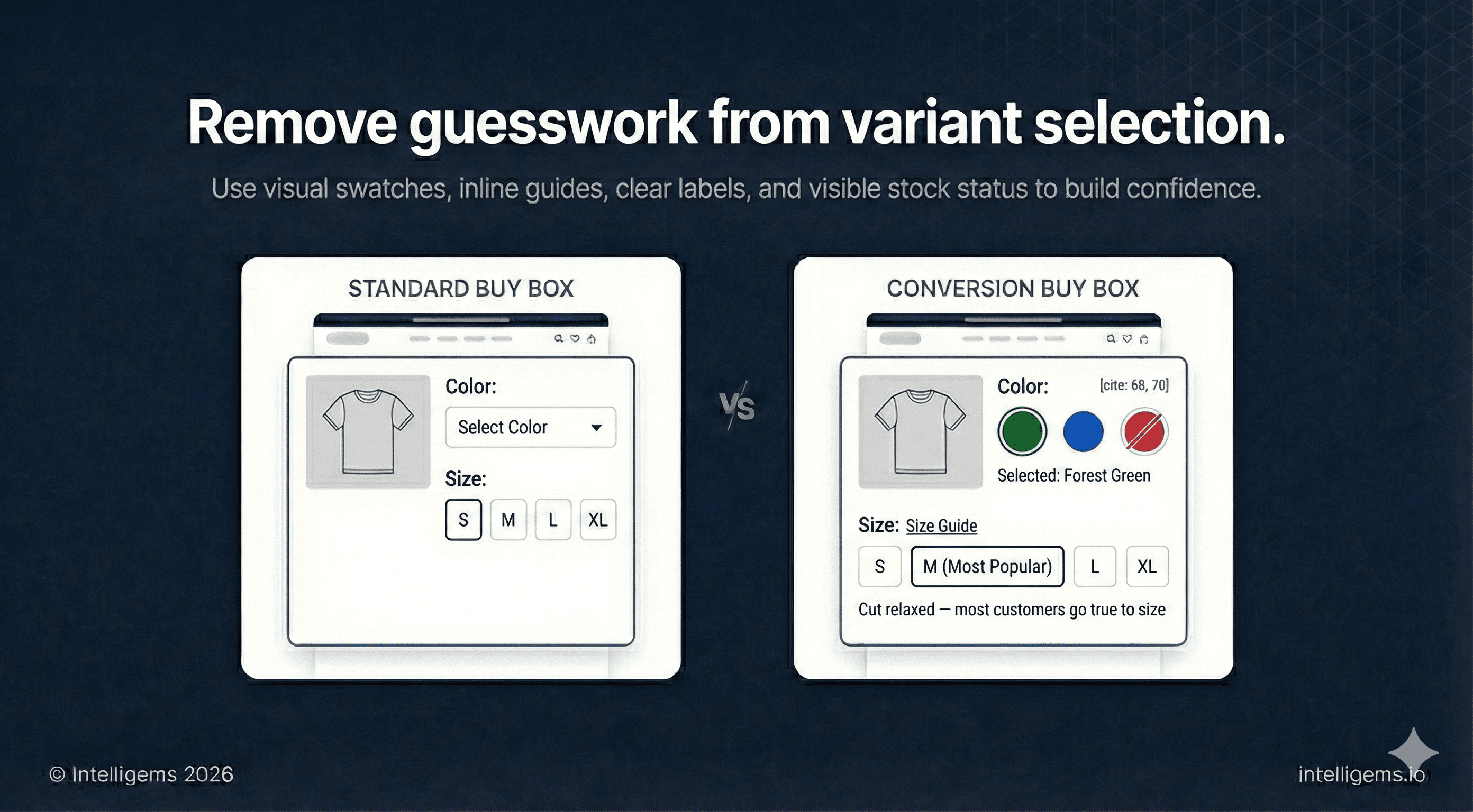
1.6 — Variant Selectors
Color:
Visual swatches over text dropdowns, always
Display the selected color name as a text label beneath the swatches
Show out-of-stock colors with a strikethrough — hiding them frustrates returning customers
Size:
Place a size guide link directly next to the size selector, not on a separate page
Visually distinguish the most popular or recommended size
Surface fit guidance inline if you have it ("Cut relaxed — most customers go true to size")
1.7 — Add to Cart Button
The single most tested element in ecommerce, for good reason.
Must be visually dominant — high contrast against the surrounding page
Full-width on mobile
"Add to Cart" is the safest default language
Place a quantity selector nearby so customers don't have to add the item multiple times
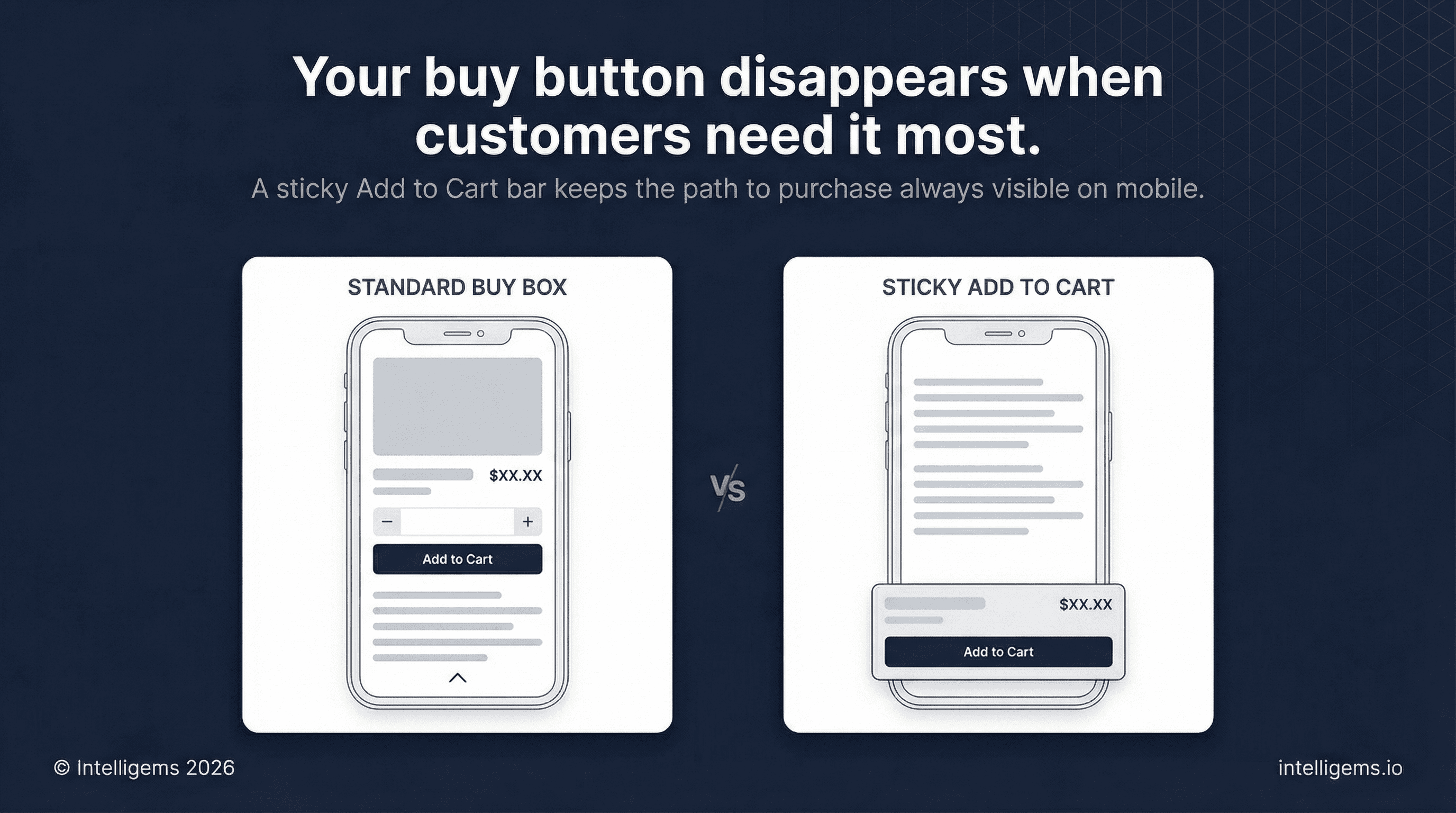
Sticky bar on mobile: As the user scrolls past the buy box, a persistent Add to Cart bar should follow them down the page. This single change consistently improves mobile conversion rates and is one of the easiest wins available in most Shopify themes.
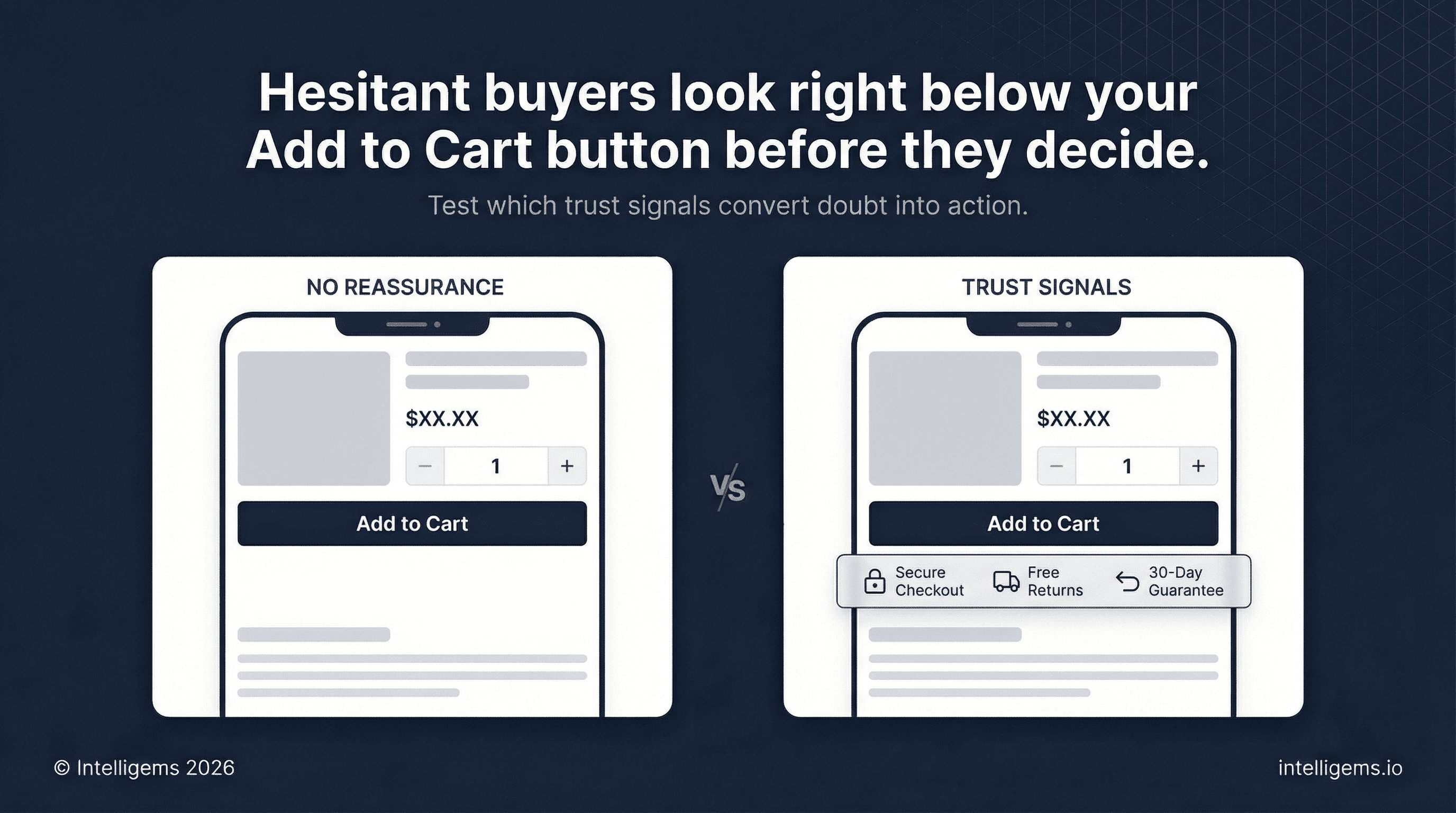
1.8 — Trust Signals
Place 2-4 trust indicators directly below the Add to Cart button. This is where hesitant buyers look right before they decide.
Formats that work:
🔒 Secure Checkout
🚚 Free Shipping over $[X] / Free Returns
↩️ [X]-Day Money-Back Guarantee
🌿 [Brand-specific: Made in USA / Certified Organic / B-Corp]
💳 Pay over time with [Shop Pay / Afterpay / Klarna]
Keep it to icon + short label. No paragraphs here.
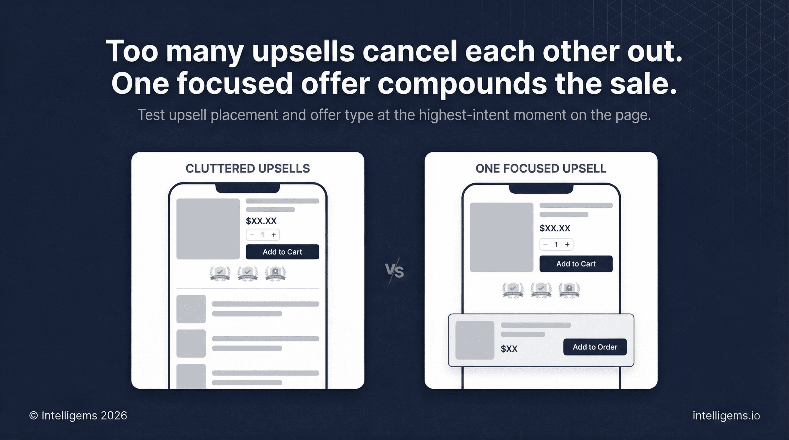
1.9 — In-Page Upsell
One upsell placement, below the trust signals, above the fold break on desktop:
Bundle / Frequently Bought Together — 1-2 complementary items with or without a small discount
Product upgrade — "Add [X] for $[Y]"
Subscription offer — "Subscribe and save [%] — cancel any time"
One focused offer. Multiple competing upsells cancel each other out.
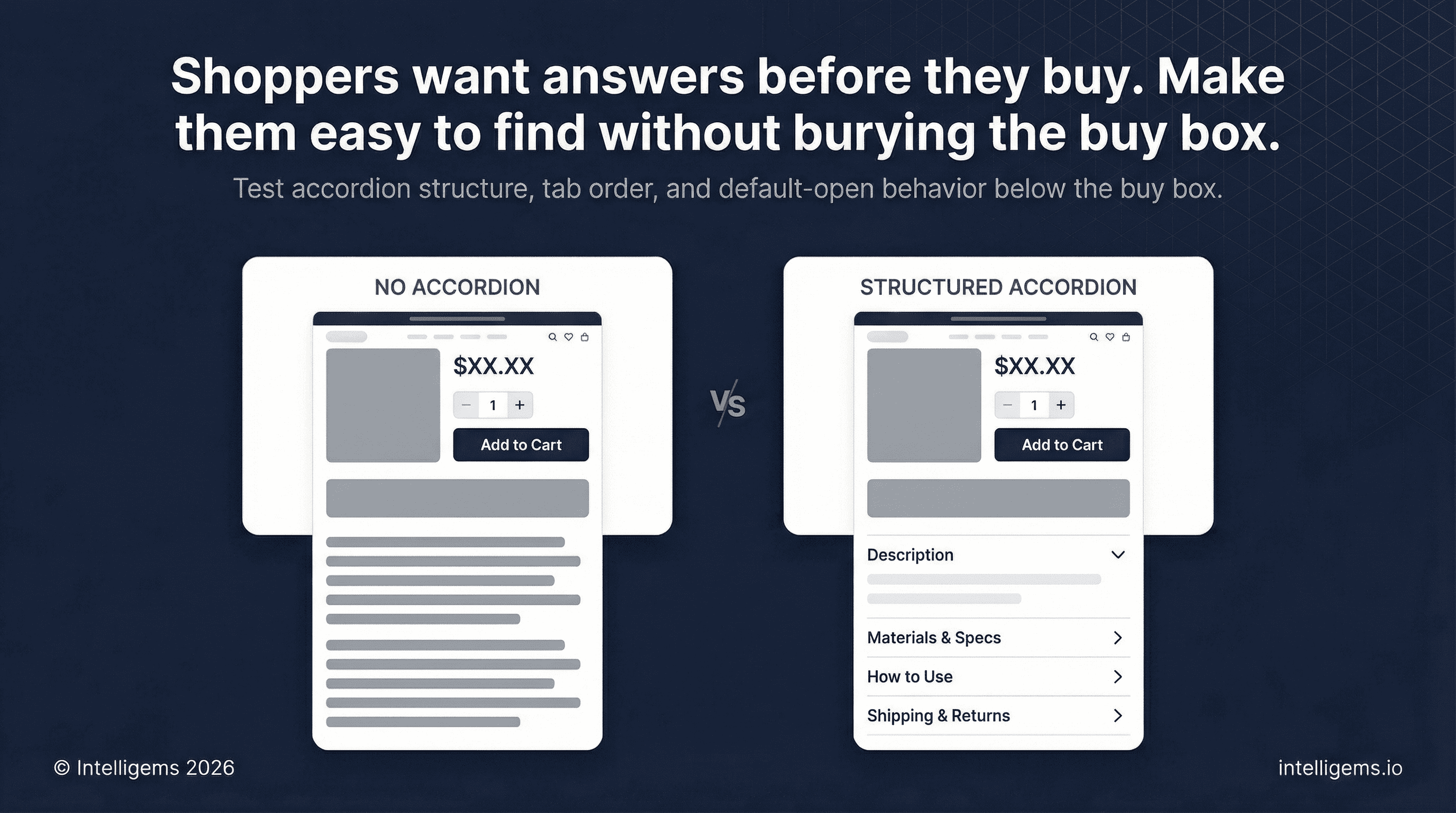
Section 2: Product Detail Tabs
An expandable accordion below the buy box surfaces supporting information without cluttering the primary purchase flow. Keep the first tab open by default so information is immediately visible without a click.
Recommended structure:
Description — the product's story, the problem it solves, why it's worth owning
Materials / Specs / Ingredients — factual, scannable, no marketing fluff
How to Use / Care Instructions — reduces post-purchase confusion and returns
Shipping and Returns — plain language, no surprises
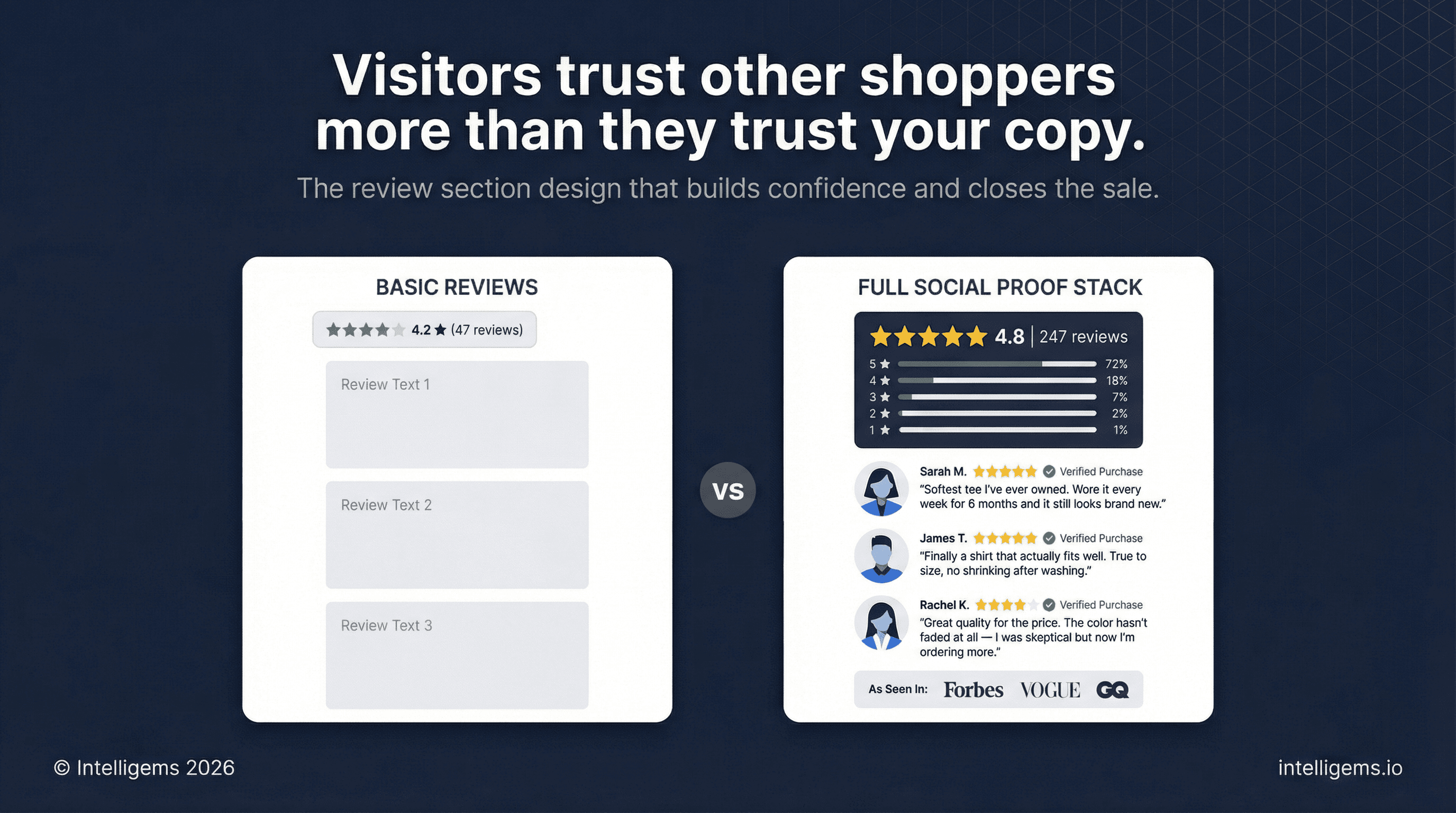
Section 3: Customer Reviews
Reviews carry more persuasive weight than any copy you write because they come from people with nothing to sell.
Aggregate block:
Large star display with total count
Star distribution breakdown (percentage of 5-star, 4-star, etc.) — this signals authenticity
Individual review cards:
Customer photos wherever available — photo reviews consistently outperform text-only
Name, verified purchase status, star rating, date
Surface your most compelling review first, ideally one that directly handles a common objection
Show at least 8-12 reviews before a "load more" prompt
Press logos (if applicable): A simple "As seen in" logo bar placed near reviews adds third-party credibility. Useful for brands with earned media, especially when selling to first-time visitors.
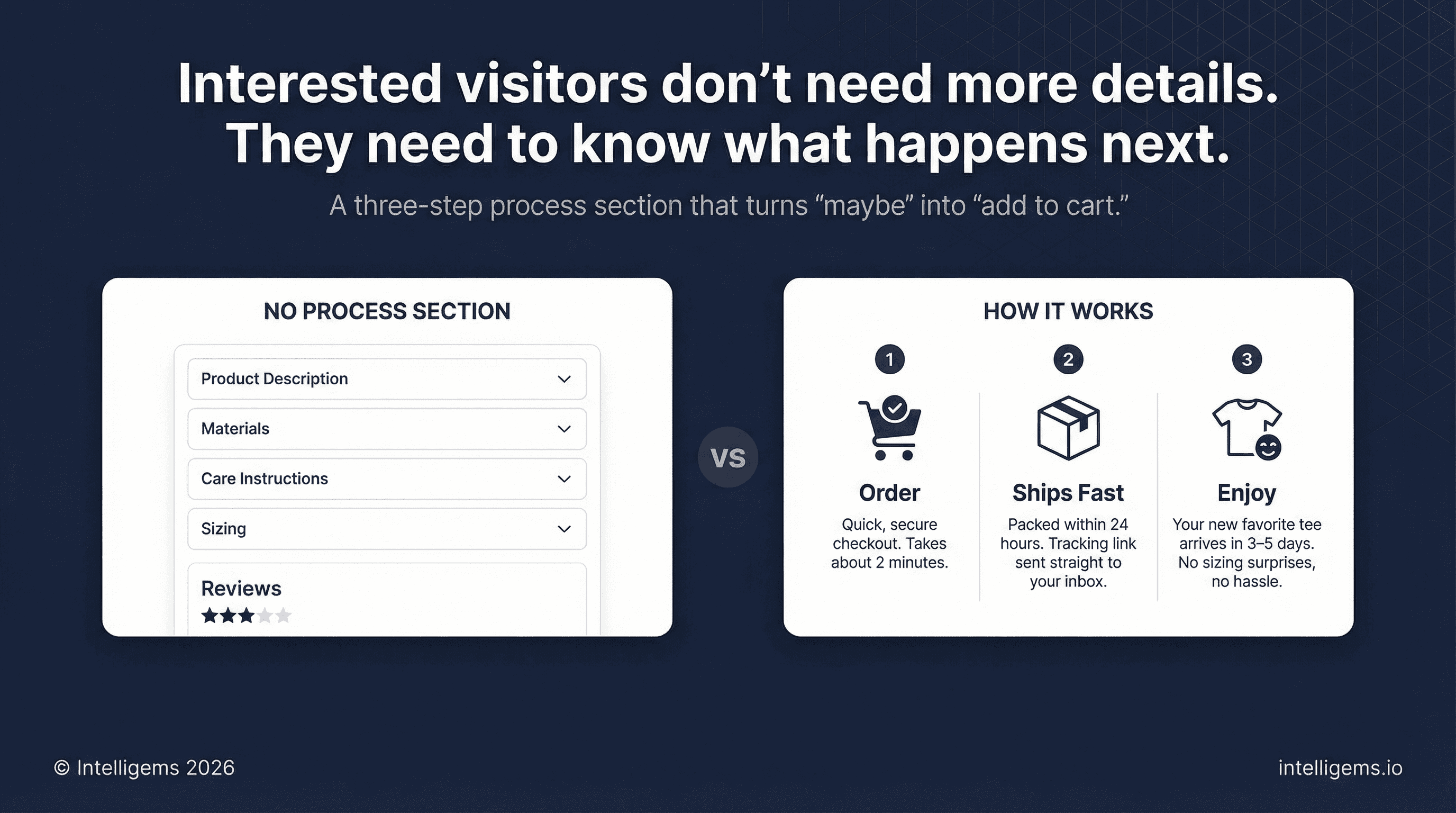
Section 4: How It Works
A three-step visual process section removes the ambient uncertainty that kills conversions for customers who are interested but unsure.
Structure:
Order — quick, secure, takes minutes
Ships fast — packed within [X] hours, tracking to your inbox
Enjoy [the outcome] — [specific benefit] in [timeframe], without [common concern]
Use three images or icons laid out side by side, numbered sequentially. Keep the copy beneath each step to two or three sentences. This section works best when the steps feel effortless rather than transactional.
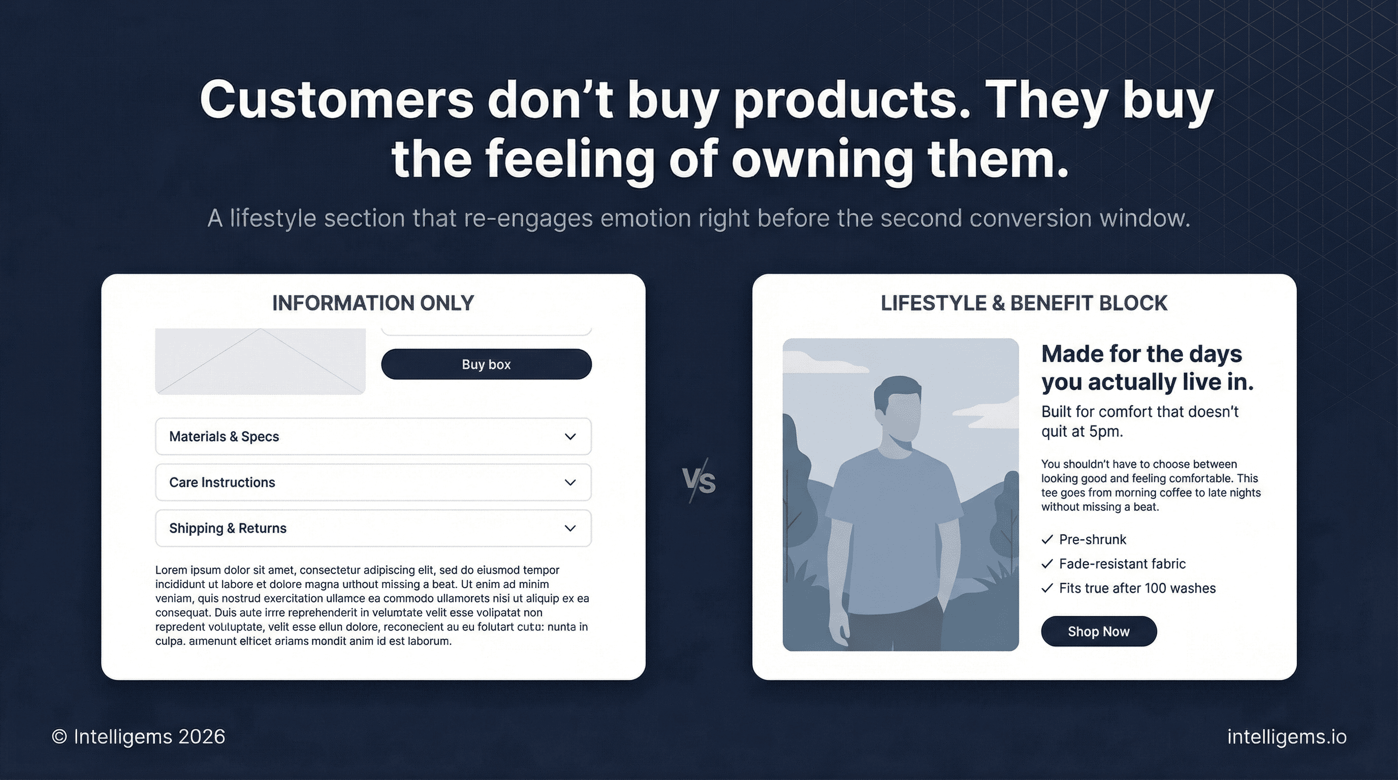
Section 5: Lifestyle and Benefit Block
After logical sections, re-engage the customer emotionally before returning to product detail.
Use a full-width or split image-and-text layout with a genuine lifestyle photograph — product in context, showing the feeling of ownership, not just the object.
Copy structure:
Headline — a promise tied to the image (style, function, or aspiration)
Supporting line — one sentence that validates or invites
Short paragraph — 2-3 sentences, benefit-led, written from the customer's perspective
Three differentiators — specific, not generic (avoid "high quality" and "great value")
CTA button — direct action language
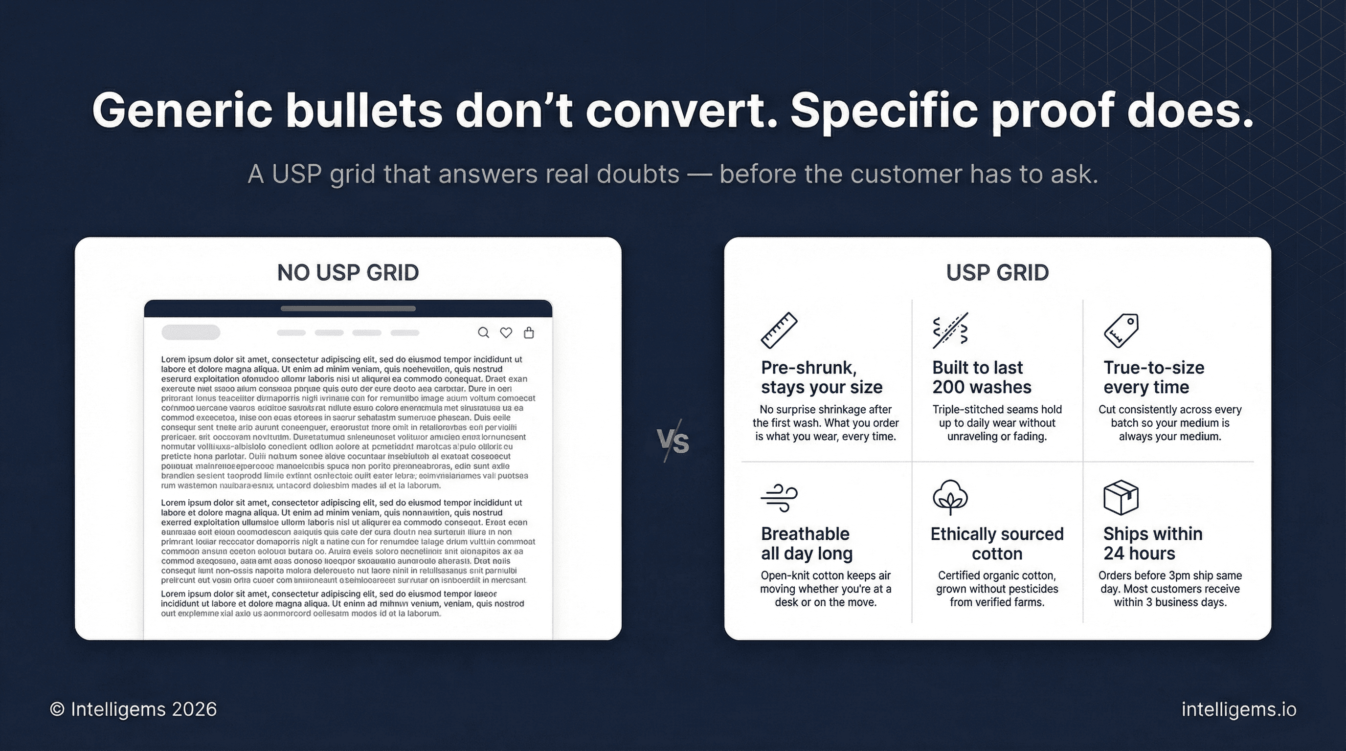
Section 6: USP Grid
A structured grid of 3-6 unique selling points, each with an icon, a headline, and supporting copy.
Formatting:
Consistent icon style throughout (don't mix weights or styles)
Headline: 3-5 words
Supporting copy: 2 sentences that go deeper than the headline and address a real customer doubt
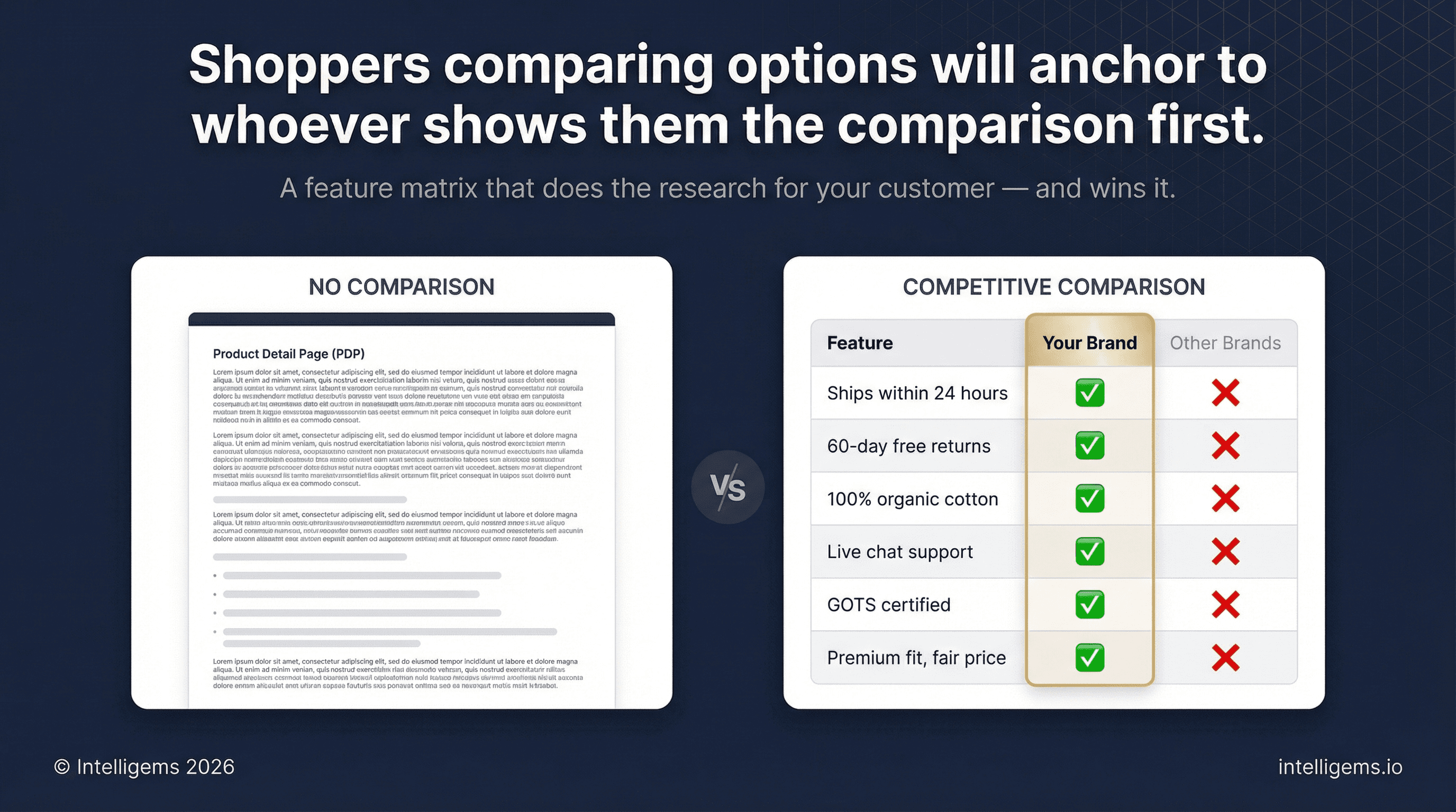
Section 7: Competitive Comparison
A feature matrix that shows why shoppers should choose you over the generic alternative. You don't need to name competitors — "Other Brands" works fine.
Setup:
Left column: 4-6 features that matter to your buyer
Your column (visually emphasized): ✅ across the board
Competitor column(s): ❌ on the attributes you own
Good features to highlight: shipping speed, return window, material quality, customer support, certifications, and price-to-value.
This section works because it does the comparison research for the customer. Shoppers who are evaluating multiple options will anchor to it.
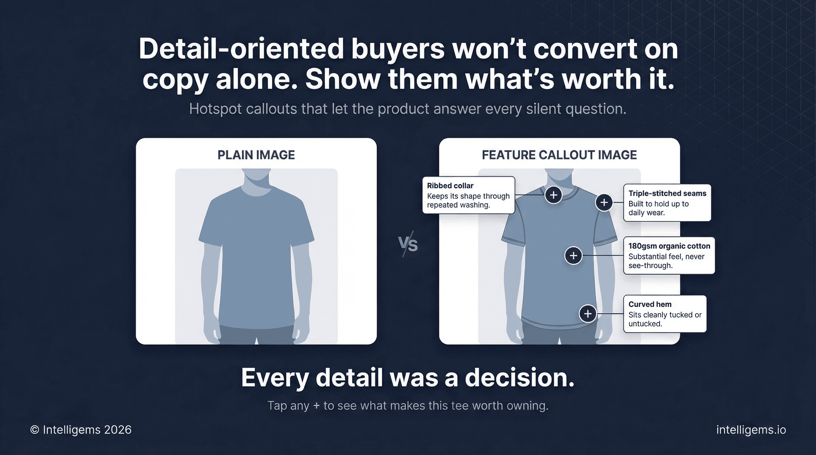
Section 8: Feature Callout Image
A large, high-quality lifestyle photograph with labeled callouts pointing to specific product features or materials.
Use "+" markers or numbered hotspots that expand to show a short label and one-line description. This works especially well for:
Apparel with functional or material details
Gear and equipment with multiple components
Beauty and wellness products with ingredient stories
Headline: A short promise tied to what the image communicates Subheadline: One line that reinforces ease or discovery
This gives detail-oriented buyers a visual deep-dive without requiring a wall of text.
Section 9: FAQs
Five to seven questions that address the most common reasons someone would hesitate to buy. Written in plain, conversational language.
Questions to include (adapt to your product):
What makes this different from [generic alternative]?
What if I'm not satisfied?
How quickly will I receive my order?
What's your return or exchange policy?
Is this right for [specific customer situation]?
How do I care for this / will it last?
Layout: Expandable accordion list on one side, lifestyle photo or short video on the other. The visual prevents the section from feeling like fine print.
Unanswered pre-purchase questions are one of the top drivers of cart abandonment. FAQs plug those leaks directly.
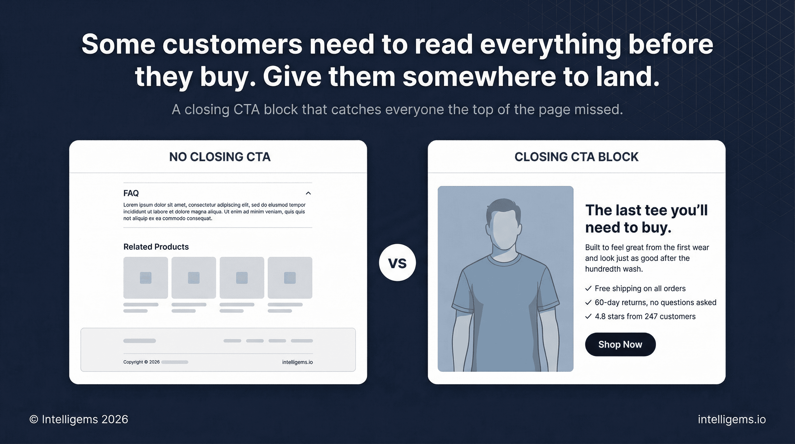
Section 10: Closing CTA Block
A dedicated conversion section at the bottom of the page for customers who read everything before deciding.
Mirror the structure of the lifestyle and benefit block from Section 5:
Lifestyle image
Restate the core product promise
1-2 sentences on the transformation or outcome
Three trust or value signals
High-contrast CTA button
Many customers who weren't ready at the top of the page will be ready here. Give them a clean place to act rather than making them scroll back up.
Section 11: Related Products
3-4 product recommendations before the footer.
Best practices:
Same category or complementary use case
Show: image, rating, review count, price (sale price if applicable)
Include a clear "Shop Now" CTA on each card
Dynamic recommendations based on browsing behavior outperform static curation for stores with large catalogs
A customer who doesn't convert on this product may convert on another. Related products keep that revenue in-store.
Full Page Flow
Note: These can be combined, condensed, reduced, or expanded in any way. Think of this as a menu. You can adapt to your brand, customer, and products.
# | Section | Job |
|---|---|---|
1 | Image Gallery | Desire and product clarity |
2 | Rating Summary | Instant trust |
3 | Product Title + Positioning Line | Relevance and benefit framing |
4 | Price + Availability | Urgency and transparency |
5 | Benefit Bullets | Quick win for skimmers |
6 | Variant Selectors | Personalization and fit |
7 | Add to Cart Button | Primary conversion action |
8 | Trust Signals | Objection removal |
9 | In-Page Upsell | AOV lift |
10 | Product Detail Tabs | Information for detail buyers |
11 | Customer Reviews | Deep trust and social proof |
12 | How It Works | Process clarity |
13 | Lifestyle and Benefit Block | Emotional re-engagement |
14 | USP Grid | Rational reinforcement |
15 | Competitive Comparison | Contextual framing |
16 | Feature Callout Image | Tactile product understanding |
17 | FAQ | Objection removal |
18 | Closing CTA Block | Second conversion window |
19 | Related Products | Revenue retention |
Mobile
Over 60% of Shopify traffic is mobile. Design for mobile first, then scale up.
Sticky Add to Cart bar that follows the user as they scroll past the buy box
1:1 image ratio in the gallery
Tap targets at minimum 44x44px
Accordion sections are not a mobile compromise — they're best practice
16px minimum body font size
Test on a real device, not just browser preview
What to Test First
Once the page structure is in place, these elements have the highest testing ROI:
Hero image (product-only vs. lifestyle vs. UGC)
CTA button copy
Title and positioning line
Review section placement (above vs. below the fold)
Trust signal placement (below CTA vs. near price)
Number of benefit bullets (3 vs. 5)
Test one element at a time and wait for statistical significance before acting on results.
AB Testing
AB Testing
AB Testing


