
Ecommerce Strategy
UX changes for a more profitable Black Friday
Every site change for a sale has a cost.

A sale changes what shoppers do only when they see the saving and trust the reason to buy now, and each site change helps one of those at a cost. An existing crossed-out price or a banner shows the saving before checkout, a progress bar shows how close a perk is, and a countdown makes a real deadline visible.
A timer and a banner are the easy last-minute adds, but with an offer alone, the saving appears only in the cart or at checkout.
An offer leaves product pages at full price
Your offer is set and your sale starts in days. What is left to tune is the site around it.
By default, a code or an automatic discount leaves your product pages at full price. Picture a shopper who clicks your sale email, lands on a product page at its usual price and sees no discount until the cart.
A saving shoppers cannot see changes nothing they do. That makes your product pages the place your sale is seen or missed.
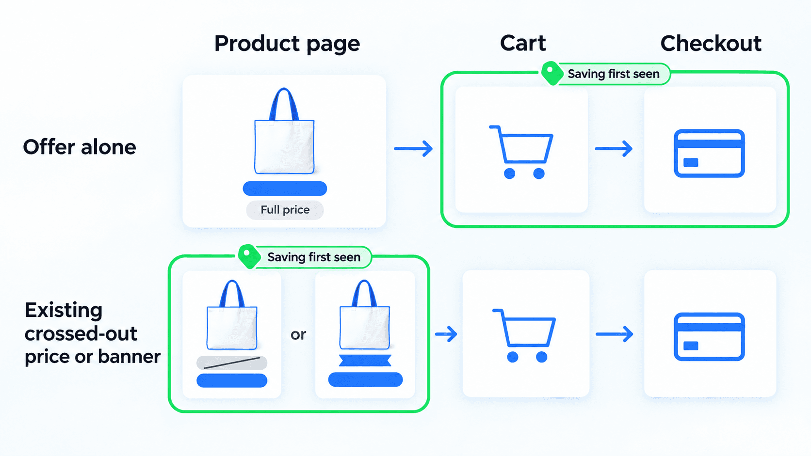
A crossed-out price leans on the old price
A crossed-out price puts the saving on your product and collection pages. The old price works as an anchor that changes how the new one feels. That can read as a real deal or make shoppers doubt it.
A code, by contrast, hides the saving until shoppers enter it. Which framing your shoppers respond to cannot be said in advance, so neither is a safe default.
Getting a crossed-out price means marking prices down, which changes how the discount applies. So it is a decision for your next sale, not this one. If your prices are already marked down, showing or hiding the crossed-out price is a test you can run now, with the price unchanged.
A banner carries the offer onto the page
A banner or badge near the price shows the saving on your product and collection pages, while your prices and offer stay as they are. That makes it a change in how your offer is presented, testable during the sale. Its cost is one more price that has to match what checkout charges.
A banner competes with whatever promo text you already run. In one home-goods store’s Labor Day 2026 test, a banner showing each price after the code was not ahead of the usual promo text. It was paused after a couple of days, so the read is directional. What your announcement bar says is its own question.
A countdown needs a deadline shoppers believe
A countdown gives your shoppers a reason to buy now only when it counts to something real, such as the end of your sale.
A countdown to midnight on your sale’s last day says something true. One that restarts every day while nothing ends reads as fake scarcity. In one apparel store’s Labor Day 2026 test, a checkout countdown that ended with the sale edged ahead on revenue per visitor, a directional read.
Its cost is pressure, which lands differently by audience, so one store’s read may not carry to yours.
Shoppers only chase a threshold they can see
A free-shipping threshold or a spend-more tier exists to get shoppers to add a little more. A progress bar in your cart shows how close they are as the cart changes.
Its cost is a number that has to match your cart, or the bar misleads. One bags store’s bar measured carts after the store’s spend-more discount, so shoppers just over the line were told to add more. That means a bar is worth testing only once its number matches the cart.
Whether the threshold itself moves during a sale is a separate decision.
What your shoppers miss decides the change
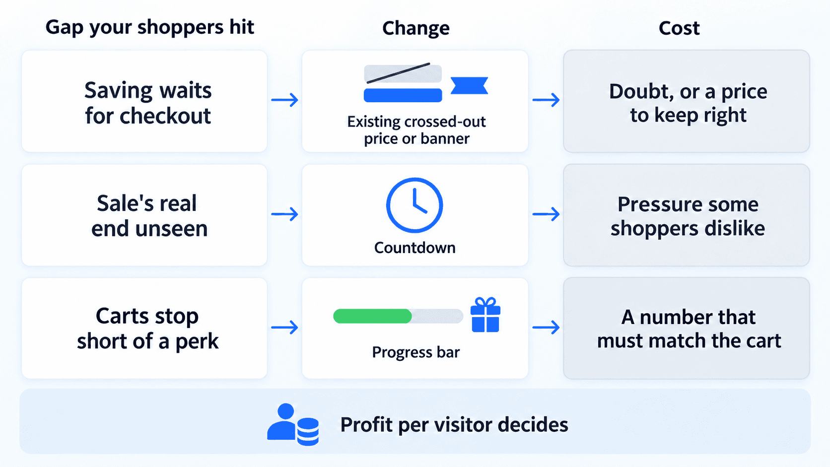
Each change closes one gap, so the gap your shoppers hit decides which to test.
If the saving waits for checkout, an existing crossed-out price or a banner shows it sooner, at the cost of doubt or a price to keep right.
If shoppers cannot see your sale’s real end, a countdown shows it, at the cost of pressure some shoppers dislike.
If your carts stop short of a perk, a progress bar shows the gap, at the cost of a number that must match the cart.
During a sale, conversion rises whatever you change, so profit per visitor settles it. It shows whether a change drove profitable orders or only more of them. For a progress bar, order value is the tempting number.
Test one or two changes during your sale
Before your sale starts, line up one or two changes to test on your current offer.
Name the gap your shoppers hit.
Pick one or two changes that close it.
Keep your offer, its depth and how it applies the same while they run.
Read profit per visitor against your current page, not conversion or order value.
To see where your shoppers stall, Claude connected to the Intelligems MCP can pull the numbers. Ask it: “Show my add-to-cart rate, checkout begin rate and abandoned checkout rate for the last 30 days, and list my offers.”
What works depends on your shoppers, so strong brands judge each change by their own test. Intelligems can test how your offer is shown, on the page or in checkout on Shopify Plus, and help you read the result. Its Black Friday planning hub lays out in-season changes like these.
Content Testing
Campaigns
Ecommerce Strategy


